How I create a Sankey Diagram in plotly using python.
- Go to plotly and look at the examples there and realize that I’m still lost.
- Go find another example or tutorial in the public domain using a search.
- Realize that all of them are to vague and don’t describe any inner workings or assume you know something that you clearly do not.
- Go to stack exchange and piece meal learn how to do the task
- Write a tutorial that explains the process, start to finish.
First and Foremost!
What’s the question… Is the Sankey the best case for it? What is a Sankey chart anyways? Go here to learn more about Sankey Charts.
Best use cases for a Sankey diagram:
- You have a flow process that you want to present in a simple manner.
- You have data you want to show proportionally in a way that doesn’t involve showing hard numbers.
- You have a supervisor who just really likes overly complicated and colorful graphs that are impossible to read (what happens when it is used poorly).
My question is “How many of my department’s cases are legit and how many are dismissed?” So, it has a direction where cases move into a status of some sort. Also it has more than one starting point. For this article, I’m just going to cover the basics of the Sankey.
Now, can you use Sankey if you have only one starting point? Sure, when you have 2 or three steps, it can be a really good way to show how things move into and out various stages. But when you have one starting step and only one step out, you’ve just made a pie chart. Sankey charts are great for non-technical audiences interested in big pictures and process flows.
# import all required libraries
import numpy as np
import plotly
import plotly.graph_objects as go

#Basic example of a sankey diagram from Geeks for Geeks
fig = go.Figure(data=[go.Sankey(
    node = dict(
      thickness = 5,
      line = dict(color = "green", width = 0.1),
      label = ["Issue A", "Issue B", "C", "D", "E", "F"],
      color = "blue"
    ),
    link = dict(

      # indices correspond to labels
      source = [0, 6, 1, 4, 2, 3],
      target = [2, 1, 5, 2, 1, 5],
      value = [7, 1, 3, 6, 9, 4]
  ))])

fig.show()
STOP!
Which plotly are you using? Yup, there’s free and then there’s the fancy. I’m using the free one which is “plotly.graph_objects”
Moving on from here, we can see the first block of code produces a diagram like this.

Let’s edit the code a little so we can better understand what the code is actually doing.
fig = go.Figure(data=[go.Sankey(
    node = dict(
      thickness = 5,
      line = dict(color = "orange", width = 0.5),
      label = ["Intake", "Holding", "Experiment 1", "Experiment 2", "Pass", "Out-Process", “”],
      color = "pink"
    ),
    link = dict(

      # indices correspond to labels
      source = [0, 1, 2, 3, 4, 5],
      target = [1, 2, 3, 4, 5, 6],
      value = [1, 1, 1, 1, 1, 1]
  ))])

fig.show()
Giving us this output:

label = ["Intake", "Holding", "Experiment 1", "Experiment 2", "Pass", "Out-Process", “” ]
label = [0 , 1, 2 , 3 , 4, 5 , “”]
Notice that all the source and target values are in order (where the source is target-1). We can correlate this to the labels in the node.
At this point, you may wonder about the value “6” in the target list. Well, plugging any number higher than the max length of the list will result in a straight line. The number 6, 99, or 10987 all result in the same output (our straight bar). In my case, the last position of the labels list is just an empty string.
If we use any value equal to or less than the length of the labels list we end up with a diagram that curls back into itself.
source = [0, 1, 2, 3, 4, 5],
target = [1, 2, 3, 4, 5, 5],
value = [1, 1, 1, 1, 1, 1]
What we get with the values listed above.
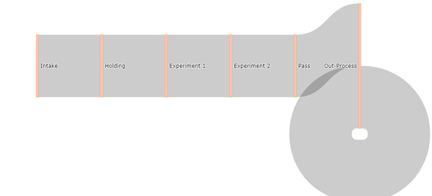
If we use the following values we end up with a more funnel shaped diagram.
source = [0, 1, 2, 3, 4, 5],
target = [1, 2, 3, 4, 5, 6],
value = [2**0, 2**1, 2**2, 2**4, 2**5, 2**6]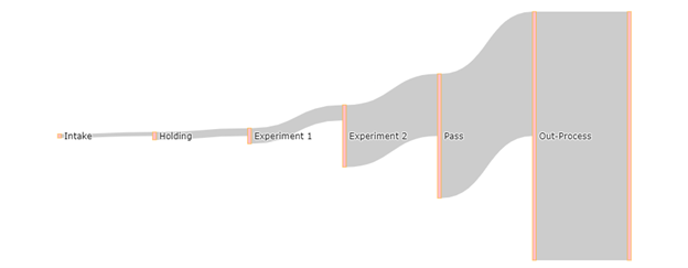
It’s important to note that the values in the values list have no bearing on each other. They do not have to add up in any way or correlate in any other way.
All the above are some sort of “funnel” graph made with the Sankey diagram. To really use the Sankey, we want to have various stages at different places.
So let’s have 5 pretend people going through my imaginary study. In this study, different subjects are either subjected to experiment 1, experiment 2 or both, and then do an out-process task with the experimenter all on different dates. If a subject leaves the study early, declines, or fails to return then they are described as a “Drop.”
| Person | Step 1 | Step 2 | Step 3 | Step 4 |
| Person A | Intake | Holding | Drop (step3) | — |
| Person B | Intake | Experiment 1 | Pass | Out-Process |
| Person C | Intake | Experiment 1 | Experiment 2 | Out-Process |
| Person D | Intake | Holding | Experiment 2 | Out-Process |
| Person E | Intake | Experiment 1 | Experiment 2 | Drop (step4) |
I’ve added a potential stage called the “Drop” stage that indicates that someone left the study early.
To translate to this use for the Sankey diagram, it helps me to draw/write it out.
label = ["Intake", "Holding", "Experiment 1", "Experiment 2", “Drop1”,  "Pass", "Out-Process", “Drop2” ]
label = [0, 1 , 2, 3, 4, 5, 6, 7]
Recall:
[0] Intake to [1] Holding = 2 people
[0] Intake to [2] Experiment 1 = 3 people
[1] Holding to [3] Experiment 2 = 1 Person
[1] Holding to [4] Drop1 = 1 Person
[2] Experiment 1 to [3] Experiment 2 = 2 people
[2] Experiment 1 to [5] Pass = 1 Person
[3] Experiment 2 to [6] Out-Process = 2 People
[3] Experiment 2 to [7] Drop2 = 1 Person
[5] Pass to [6] Out-Process = 1 Person
This creates the following lists:
Text Box: source =[0,0,1,1,2,2,3,3,5],
target =[1,2,3,4,3,5,6,7,6],
value =[2,3,1,1,2,1,2,1,1],
Which outputs the following:
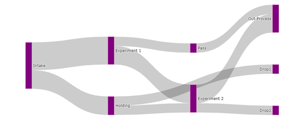
To change the colors of the links or nodes we can pass a list of colors to the link and node dictionaries.
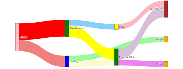
Can we make this look any more distinct?
Yes, plotly will allow us to pass a list of colors that annotate stages.
Input:
#should have the same number of colors named as the links (the length of the values list) and in that order
color_link = ['lightcoral', 'red', 'lemonchiffon', 'palegreen', 'yellow', 'lightskyblue', 'thistle', 'violet', 'lightpink']

#color node follows the order of your labels
color_node = ['pink', 'blue', 'green', 'green', 'orange', 'yellow', 'brown', 'orange']


#Basic example of a sankey diagram from Geeks for Geeks
fig = go.Figure(data=[go.Sankey(
    node = dict(
        thickness = 20,
        pad = 100,
        line = dict(color = 'black', width = 0.5),
        label = ["Intake", "Holding", "Experiment 1", "Experiment 2", "Drop1", "Pass", "Out-Process", "Drop2"],
        color = color_node
    ),
    link = dict(

      # indices correspond to labels
      source = [0,0,1,1,2,2,3,3,5],
      target = [1,2,3,4,3,5,6,7,6],
      value =  [2,3,1,1,2,1,2,1,1],
        color = color_link
  ))])

fig.show()
Output:
And that’s all I have for now guys.
