It’s an interesting time to be in analytics for sure. Maybe things look bleak and scary as more and more of the difficult and tedious work can get automated away with AI. It’s hard to see the skills that took you years to master accomplished by a machine within a few seconds. However, depending on where you work can make all the difference in the world.
See, the secret to successful AI implementation isn’t just getting the product or engineering team to plug into your database. There’s one key thing that needs to happen.
Treating data like an asset.
Author: Jessica Faulk
bookmark_borderRound to Even – R to Excel Mishaps

Why sometimes your calculations don’t match your expectations.
As I was updating a report for work, I couldn’t get the numbers to quite match up. The task was simple enough, take the old report from Excel and automate it using R. Easy Peasy.
However, my coworkers Excel report had 83 and my report had 82.
Where did I go wrong?
After some soul-searching and an even more extreme amount of time on Stack Exchange, I had my answer. Rounding. This was my first time matching a report originally built in Excel with R. I had done this before with python, but python’s generic rounding behavior matches Excel’s.
See, rounding isn’t as simple as what was taught to many of us in school. If its five go up, less than five you go down. In fact, there’s a lot of different methods for rounding. Check out the Wikipedia article on Rounding to see what I am talking about. I won’t get into all the different rounding methods for the sake of my sanity and yours, but understand that rounding isn’t all that simple. If you want a more friendly take on rounding try Mathisfun.com.
There’s also a whole thing on IEEE standards, but I write this blog for less technical folks who want to know more about data so I won’t go into that. Just know that different programs may use different rounding methods.
The Issue I had.
So my issue was that my coworker was using Excel to create a rather simple report on some HR metrics that we do monthly. The values needed to be rounded to the nearest whole number for presentation, so he used excel to do that work. When I went to QA my work, my calculations were not matching up.
So what was happening?
Excel uses the more common method of “half round up”. All that means is that if it sees a “5” as the last digit, it will go up. In my case, it was rounding 82.5 to 83.
Meanwhile, R uses “round to even” which means it will round the value to the nearest even number when it is at the halfway point (in my case 82.5). I asked R to round to the nearest whole number and it spat back 82.
Fun. This is why sometimes calculations don’t match your expectations.
How do I fix this?
Well, it really depends on your audience for starters. Do they even care about that half digit? In my case, we were working with such small values to compute a percent that, sadly, yes it did matter. So I had to go digging around and fiddling about until I could write a function that would emulate the excel method of rounding. On review, maybe there’s a package I could find. Additionally, my consumer was also much more comfortable with excel than anything else so they really wanted it to match that behavior.
In other instances, you can alter the code. Excel can force round down or round up. SAS has functions that do even or odd rounds. Python is quite flexible when it comes to rounding but I might just love python.
bookmark_borderForensic Friday – Texas ICU Beds
So a little while ago, I came across a post on Nextdoor by a neighbor questioning why ICU beds are in short supply when the last times there were surges, it wasn’t this dire.
HINT: It was, but now is exceptionally bad.
So let’s start by looking at the graph he provided me.
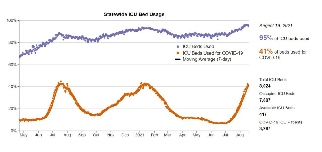
Source: https://covid-texas.csullender.com/
First let’s breakdown what this chart tells us. Let’s note the x and y axis. The x axis is just a simple time series going from May 2020 to Now. Ok, that’s straight-forward. Now, the Y axis is a percentage of beds used which is a reasonable metric, except for one thing. See, the number of ICU beds is NOT constant. It can change from day to day based on how many nurses can work, number of doctors, mechanical issue, etc. We can see that during the previous peaks, the beds used did go up but not quite the same as we are seeing at the Aug 2021 points. Each point is a single day, so we can assume that this is an extensive data set. In this state we can see that there is a correlation between the amount of covid cases and the number of ICU beds occupied. The percentage of beds occupied by covid patients goes up, so does the total number of ICU beds being used. This makes sense as other incidents that land people in the ICU (car wrecks, strokes, and so on) don’t go away with when COVID surges happen. Now, some of that did occur when we were in lockdown as outside factors for injuries were reduced. For example, with less driving there’s less chance for anyone person to happen to experience a car crash.
At this point, many commenters assumed that the number of beds stayed constant, and I argued that this wasn’t guaranteed. As a result, I took the time to look into the ACTUAL numbers. At the very bottom of the page is a link to this individual’s github with all the data and code he used for this project.
Link: https://github.com/shiruken/covid-texas
I always start with the README file. This file should provide general descriptions of the data source, how it was transformed, and anything else of note. Read it here: https://github.com/shiruken/covid-texas#readme
In this python script, we can see what dates were manually removed. https://github.com/shiruken/covid-texas/blob/master/fetch.py
I’ll go back in a bit and take a look at these values he manually removed, what I am really concerned with is looking at the actual numbers he used, versus the percentage.
I’ll start by cloning the repository from github and reading that file into a jupyter notebook and then taking the data into a separate notebook while I reference the original code. *Note, for some reason I can’t find that notebook… lame.
Well, we can look at the column names and see what we have. The things I am interested in is the ICU beds at the statewide level. Let’s filter to just the beds at the State level.
Looking at the columns, we need to add the available beds and the occupied beds to ascertain the total number of beds. Let’s do this now and call it ‘total_icu_beds’.
Here’s what the bed count looks like for the state of Texas when looking at just the number of ICU beds we have.
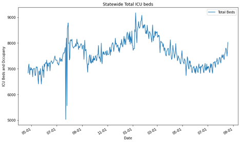
Oof, it looks like there was a weird outlier for some reason last year. I’ll add that to a list to investigate at the end. Clearly, the number of beds has a significant variation over the past year ranging from ~6000 to ~9000 beds. [let’s ignore the weird outlier for now].
Ok, next we want to see the number of beds occupied and how many of those beds were occupied by covid patients and add them to the chart.
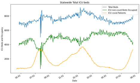
All right, so we can see that there’s the weird blip in July/August 2020 but other than that the data looks like it is expected. We find out answer in the README.txt, “All data is incomplete between July 23 to July 28 due to a transition in hospital reporting to comply with new federal requirements.” That aberration checks out and it’s going to be pursed any further.
Now the chart is still wonky since the orange and green lines should be additive. At this point they are laid atop one another. Let’s change those to area charts or stacked bar charts.
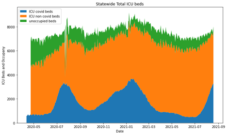
Ok, so now we have something useful for the total occupancy of ICU beds in Texas. Clearly, there’s a lag in tracking the entire number of beds for a small amount of time, but that picks up at the end of April. Again, we have that weird outlier set from the transition in hospital reporting. As we can see, the total number of beds changes overtime and it not static. The amount of those beds taken by COVID-19 patients rises significantly during surges and displace other individuals who might need ICU treatment, but again not everyone can be displaced. Here’s the real point of concern. Look at the green section at the August 2021 position. That’s horrifying. In the entire pandemic, Texas has not been this close on the margin, the entire time.
BONUS
Let’s look at some cities! Note here, the y axis on all three of these are different because the cities are all very different in size.
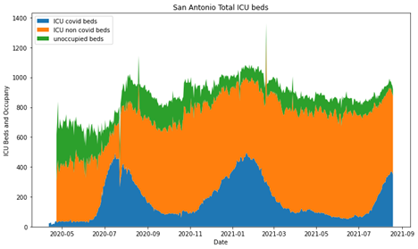
Then Austin
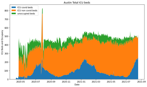
and lastly, Longview/Tyler
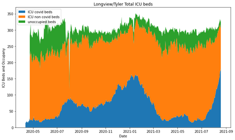
So, overall I think the original graphic is good, I’m not knocking this persons skills. They did a great job and had AMAZING documentation. However, it’s really easy to forget that percentages can obscure some really meaningful information.
bookmark_borderSankey Diagram Tutorial
How I create a Sankey Diagram in plotly using python.
- Go to plotly and look at the examples there and realize that I’m still lost.
- Go find another example or tutorial in the public domain using a search.
- Realize that all of them are to vague and don’t describe any inner workings or assume you know something that you clearly do not.
- Go to stack exchange and piece meal learn how to do the task
- Write a tutorial that explains the process, start to finish.
First and Foremost!
What’s the question… Is the Sankey the best case for it? What is a Sankey chart anyways? Go here to learn more about Sankey Charts.
Best use cases for a Sankey diagram:
- You have a flow process that you want to present in a simple manner.
- You have data you want to show proportionally in a way that doesn’t involve showing hard numbers.
- You have a supervisor who just really likes overly complicated and colorful graphs that are impossible to read (what happens when it is used poorly).
My question is “How many of my department’s cases are legit and how many are dismissed?” So, it has a direction where cases move into a status of some sort. Also it has more than one starting point. For this article, I’m just going to cover the basics of the Sankey.
Now, can you use Sankey if you have only one starting point? Sure, when you have 2 or three steps, it can be a really good way to show how things move into and out various stages. But when you have one starting step and only one step out, you’ve just made a pie chart. Sankey charts are great for non-technical audiences interested in big pictures and process flows.
# import all required libraries
import numpy as np
import plotly
import plotly.graph_objects as go

#Basic example of a sankey diagram from Geeks for Geeks
fig = go.Figure(data=[go.Sankey(
    node = dict(
      thickness = 5,
      line = dict(color = "green", width = 0.1),
      label = ["Issue A", "Issue B", "C", "D", "E", "F"],
      color = "blue"
    ),
    link = dict(

      # indices correspond to labels
      source = [0, 6, 1, 4, 2, 3],
      target = [2, 1, 5, 2, 1, 5],
      value = [7, 1, 3, 6, 9, 4]
  ))])

fig.show()
STOP!
Which plotly are you using? Yup, there’s free and then there’s the fancy. I’m using the free one which is “plotly.graph_objects”
Moving on from here, we can see the first block of code produces a diagram like this.

Let’s edit the code a little so we can better understand what the code is actually doing.
fig = go.Figure(data=[go.Sankey(
    node = dict(
      thickness = 5,
      line = dict(color = "orange", width = 0.5),
      label = ["Intake", "Holding", "Experiment 1", "Experiment 2", "Pass", "Out-Process", “”],
      color = "pink"
    ),
    link = dict(

      # indices correspond to labels
      source = [0, 1, 2, 3, 4, 5],
      target = [1, 2, 3, 4, 5, 6],
      value = [1, 1, 1, 1, 1, 1]
  ))])

fig.show()
Giving us this output:

label = ["Intake", "Holding", "Experiment 1", "Experiment 2", "Pass", "Out-Process", “” ]
label = [0 , 1, 2 , 3 , 4, 5 , “”]
Notice that all the source and target values are in order (where the source is target-1). We can correlate this to the labels in the node.
At this point, you may wonder about the value “6” in the target list. Well, plugging any number higher than the max length of the list will result in a straight line. The number 6, 99, or 10987 all result in the same output (our straight bar). In my case, the last position of the labels list is just an empty string.
If we use any value equal to or less than the length of the labels list we end up with a diagram that curls back into itself.
source = [0, 1, 2, 3, 4, 5],
target = [1, 2, 3, 4, 5, 5],
value = [1, 1, 1, 1, 1, 1]
What we get with the values listed above.
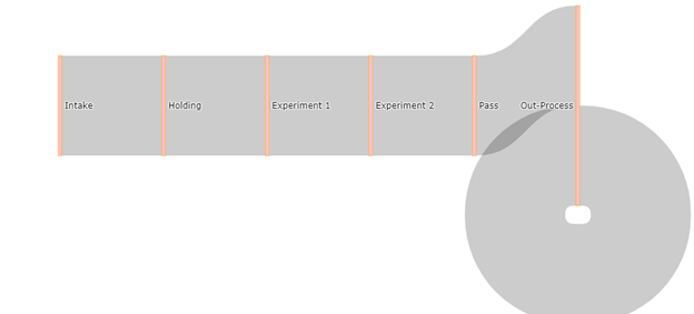
If we use the following values we end up with a more funnel shaped diagram.
source = [0, 1, 2, 3, 4, 5],
target = [1, 2, 3, 4, 5, 6],
value = [2**0, 2**1, 2**2, 2**4, 2**5, 2**6]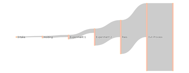
It’s important to note that the values in the values list have no bearing on each other. They do not have to add up in any way or correlate in any other way.
All the above are some sort of “funnel” graph made with the Sankey diagram. To really use the Sankey, we want to have various stages at different places.
So let’s have 5 pretend people going through my imaginary study. In this study, different subjects are either subjected to experiment 1, experiment 2 or both, and then do an out-process task with the experimenter all on different dates. If a subject leaves the study early, declines, or fails to return then they are described as a “Drop.”
| Person | Step 1 | Step 2 | Step 3 | Step 4 |
| Person A | Intake | Holding | Drop (step3) | — |
| Person B | Intake | Experiment 1 | Pass | Out-Process |
| Person C | Intake | Experiment 1 | Experiment 2 | Out-Process |
| Person D | Intake | Holding | Experiment 2 | Out-Process |
| Person E | Intake | Experiment 1 | Experiment 2 | Drop (step4) |
I’ve added a potential stage called the “Drop” stage that indicates that someone left the study early.
To translate to this use for the Sankey diagram, it helps me to draw/write it out.
label = ["Intake", "Holding", "Experiment 1", "Experiment 2", “Drop1”,  "Pass", "Out-Process", “Drop2” ]
label = [0, 1 , 2, 3, 4, 5, 6, 7]
Recall:
[0] Intake to [1] Holding = 2 people
[0] Intake to [2] Experiment 1 = 3 people
[1] Holding to [3] Experiment 2 = 1 Person
[1] Holding to [4] Drop1 = 1 Person
[2] Experiment 1 to [3] Experiment 2 = 2 people
[2] Experiment 1 to [5] Pass = 1 Person
[3] Experiment 2 to [6] Out-Process = 2 People
[3] Experiment 2 to [7] Drop2 = 1 Person
[5] Pass to [6] Out-Process = 1 Person
This creates the following lists:
Text Box: source =[0,0,1,1,2,2,3,3,5],
target =[1,2,3,4,3,5,6,7,6],
value =[2,3,1,1,2,1,2,1,1],
Which outputs the following:
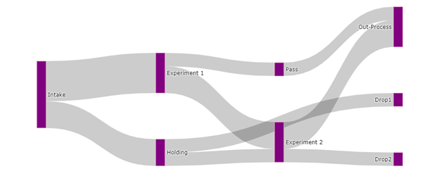
To change the colors of the links or nodes we can pass a list of colors to the link and node dictionaries.
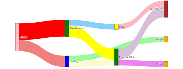
Can we make this look any more distinct?
Yes, plotly will allow us to pass a list of colors that annotate stages.
Input:
#should have the same number of colors named as the links (the length of the values list) and in that order
color_link = ['lightcoral', 'red', 'lemonchiffon', 'palegreen', 'yellow', 'lightskyblue', 'thistle', 'violet', 'lightpink']

#color node follows the order of your labels
color_node = ['pink', 'blue', 'green', 'green', 'orange', 'yellow', 'brown', 'orange']


#Basic example of a sankey diagram from Geeks for Geeks
fig = go.Figure(data=[go.Sankey(
    node = dict(
        thickness = 20,
        pad = 100,
        line = dict(color = 'black', width = 0.5),
        label = ["Intake", "Holding", "Experiment 1", "Experiment 2", "Drop1", "Pass", "Out-Process", "Drop2"],
        color = color_node
    ),
    link = dict(

      # indices correspond to labels
      source = [0,0,1,1,2,2,3,3,5],
      target = [1,2,3,4,3,5,6,7,6],
      value =  [2,3,1,1,2,1,2,1,1],
        color = color_link
  ))])

fig.show()
Output:
And that’s all I have for now guys.
